This post attempts to simplify the math that underlies goal planning. I know, it sounds complicated but don’t hang up just yet. I’m going to use a lot of pictures and keep the math to a minimum. If you can get it I promise it will be worth it.
If you’ve followed this blog you know that much of the financial planning process concerns itself with goals. Understanding how to break them down, therefore, is quite useful. For our purposes its just a two-step process:
1)Calculating them (the goals) which I call the straight lines and
2)Evaluating them for risk, the jagged lines
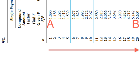
Calculating goals is the easier of the two. The calcs used are called time value of money calculations or TVM. For the most part they are mathematical representations of straight lines, think of an arrow traveling straight up from A to B. Example, if I invest $1,000 today (A) with the goal of it growing to $5,600 (B) in twenty years. What’s the compounded rate of return(a), the arrow, needed to get me there? Answer = 9%.
Step 2, the risk evaluation, is the trickier part. The arrow or the 9% from the example above, is called the target rate. It’s only a frame of reference, a context, the starting point if you will. It’s a simple A to B straight line. Life’s, however, rarely a straight line, mostly its lots of ups and downs and sideways, jagged lines. Let’s review the following images from the stock, bond and treasury markets to illustrate my point.
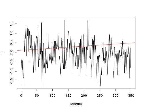
If we graph the stock market on a daily basis over the last 20 years it looks like this.

That’s a lot of jagged lines, lots of volatility.
Now let’s take that same activity and graph it over the same 20 years, where time is the horizontal axis and the market value is the vertical axis. I’ve added bond and compound annual returns for context. Note the stocks with reinvestment have a 9.1% compound annual return, our arrow as a jagged line.

Now note the ovals labeled 1 and 2. If you were holding stocks only (the blue lines) you experienced significant losses two times; between 2000 and 2002 and between 2007 and 2008. That’s investment risk, the possibility of loss. If you were holding bonds only (the gold lines) there were no losses it was slow and steady. That’s not always the case but was for this slice of time. Generally bonds are less volatile than stocks. If you were holding a combination of stocks and bonds you would have been somewhere in between. What you also must note, and I can’t emphasize this enough, is that if you were holding stocks for the whole 20 years it might have been a bumpy ride but in the end you got there and averaged a 9.1% compound annual return. I’ll come back to this in later posts.
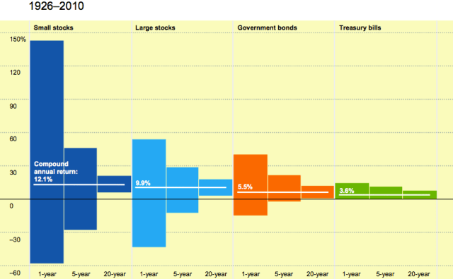
But let’s dig a little deeper into this. The above illustration showed two asset classes, stocks and bonds during the 20 year period from 1991-2010. The illustration below focuses on volatility by asset class (small stocks, large stocks, government bonds and US Treasury bills)for the years 1926 -2010. It’s constructed specifically to underscore and contrast the volatility (potential for gain or loss) over 3 different time periods: one year, 5 years and 20 years.
Let’s use the asset class large stocks to explore the ranges of volatility over time. For the entire period 1926-2010 large stocks earned a 9.9% compound annual return, that’s its arrow. In any one year the calculated volatility for large stocks ranged from a 35% loss to a 55% gain. That means the actual return for the year could be anywhere in that range. For any five-year period the range was from a 15% loss to a 28% gain, for any twenty year period it was only in gain territory and ranged between 5% to 14%.
It’s instructive to compare the groupings in their entirety. For example, compare the large stock grouping to treasury bills. The bills never go negative and the volatility range is tightly wrapped around the compound average return of 3.6%. Now compare the bills to small stocks whose compound annual return was 12.1%.
The take aways:
1)The greater the return the greater the volatility
2)The shorter the investment time period the greater the volatility
3)Different asset classes have different return and volatility characteristics
Want more? Subscribe to my blog. If you know someone who would like this, share it with them.
Footnotes:
(a)Compounded means adding the periodic interest earned (annually for example) to the original $1,000.
(b) Investment disclaimers
Past performance is no guarantee of future results.
For illustrative purposes only and not indicative of any investment.
Assumes no transaction costs or taxes.
An investment cannot be made directly in an index.


Thanks, Jay, you make your analytics easily understood even by laymen like me.
Enjoyed this very much. Very specific and “easy” to follow the lines!